In our previous Umbraco 8 projects we have installed the Formulate package to allow backoffice editors to create simple forms. Now we have started to use Umbraco 10, we discovered that Formulate is not currently available so needed to come up with another way to allow editors to create simple forms in the backoffice. I have used blocklists on some previous projects so decided to try creating a custom forms editor using a blocklist approach.
What does it need to do?
- Allow editors to add custom forms to a document
- Allow as much flexibility as possible to add form controls to each form
- Submit the form to a SurfaceController for processing
The end result still requires some custom coding of the SurfaceController once a form is setup (see section below), but it does allow the ediors to define the forms and add the controls they need.
Required Elements
To get started I created some base elements to use as Settings models for the Form, FormFields plus a KeyValuePair element for creating dropdowns, radiobuttons etc.
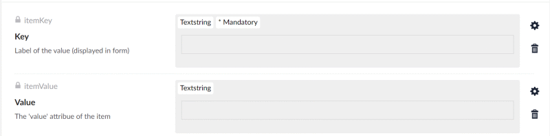
The KeyValuePair element has two text fields and will be used as the basis of a blocklist for any control that requires key value pairs, dropdowns, checkboxes etc.
- Key (TextString)
This is the text/label displayed for the form control. - Description (TextString)
The value of the form control, this will be passed to the SurfaceController.
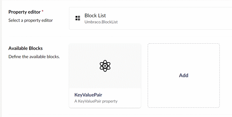
I also added a Blocklist Data Type to use the KeyValuePair element. This will be used to create checkboxes, radiobuttons and lists etc.
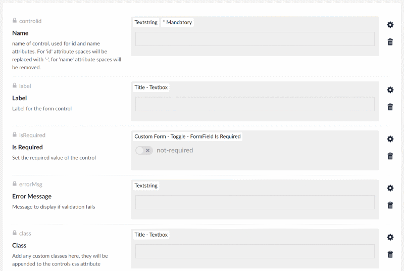
The FieldSettings element contains all the common attributes and settings required to create a standard html form control.
- Name (Textstring)
Used for the form control's name and id attributes, if the name contains spaces they will be removed for 'name' attribute and replaced with '-' for the id. - Label (Textstring)
The label displayed for the form control. - Is Required (True/False)
Toggle to make form control required or not required. - Error Message (Textstring)
The message to display if validation fails. - Class (Textstring)
Custom classes for the form control.
This element will be used as the settings model for each form control added to the Controls BlockList.
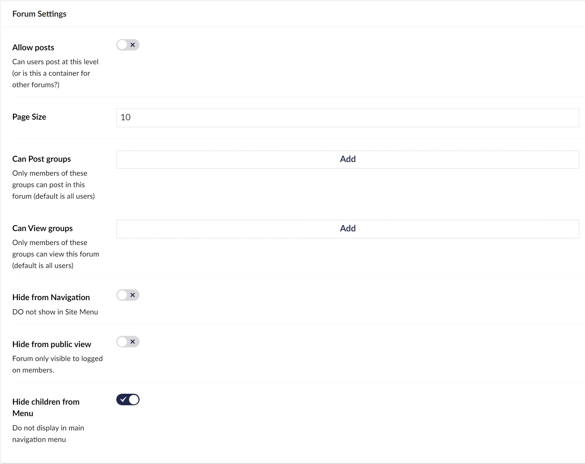
The FormSettings contains the settings for the Form Blocklist.
- SurfaceController action (TextString)
The name of the Action to use when submitting the form. - Display Title (True/False)
Show the form title as a legend tag for the form. - Use Captcha (True/False)
Adds an anti bot captcha to the form.
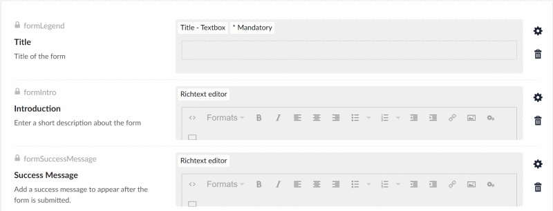
A second Element Type was created for the CustomForm to add some content for the form to use.
- Title (TextString)
Title of the form. - Introduction (Richtext Editor).
A short description explaoning what the form is about, appears above the form tags. - Success Message (Richtext Editor)
A message to display on successful submission of the form. - Form Controls (Blocklist)
The controls Blocklist for adding form conrols to the form.
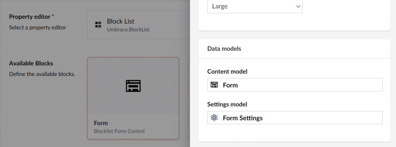
A Blocklist Data Type was added to enable adding the form to a Document Type. It uses the Form element type for the Content model and FormSettings for the Settings model.
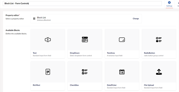
Form Control Elements
With all the base elements and Blocklist data types created the next job was to create the elements for the actual form control types that will be available for editors to select.
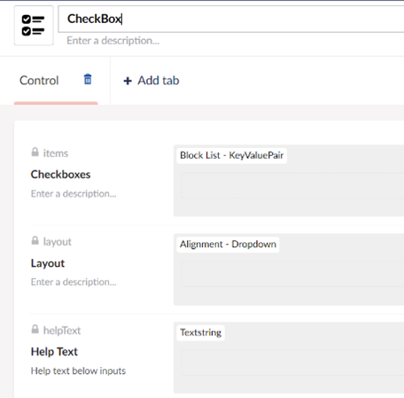
CheckBox & RadioButtons
- Items
set of KeyValue pairs for the checkboxes or radios items - Layout
Choose between horizontal or vertical layouts - Help Text
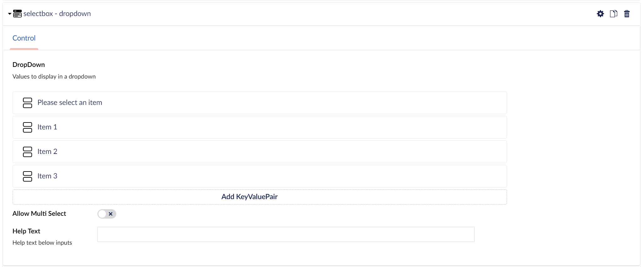
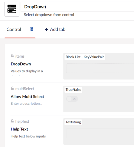
DropDown
- Items
set of KeyValue pairs for the dropdown items - Multiselect
allow selection of multiple value - Help Text
RichText
- Rows
number of rows for the RichText container, uses TinyMCE - Help Text
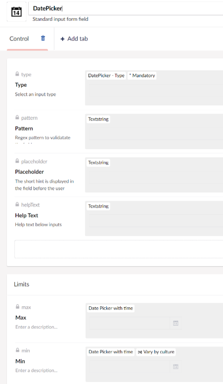
DatePicker
- Type
Choose from date, time, date+time, week or month selectors - Pattern
regex validation expression, if required - Placeholder
- Help Text
- Max
maximum date limit - Min
minimum date limit
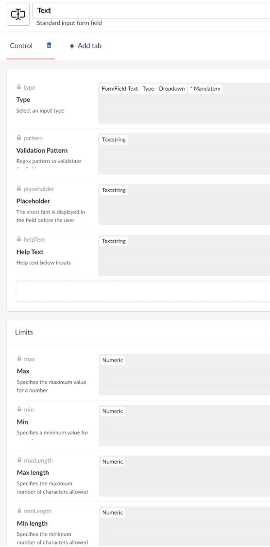
Text
- Type
Chose the input type, text, number, password etc. - Pattern
regex validation pattern - Placeholder
- Help Text
- Max (number field only)
- Maximum value allowed for number field
- Min (number field only)
minimum value for number field - Max Length
maximum number of characters allowed - Min Length
minimum characters allowed
And finally a blocklist datatype was created to allow adding the field elements to the form blocklist.