Building a Custom Collection View with Images in Umbraco 17
A deep dive into creating a modern, image-rich card view for your Umbraco backoffice
Introduction
Out of the box, Umbraco provides excellent collection views for managing content—list views, grid views, and more. But what if you want something tailored to your specific content types? What if you want to display thumbnails from your documents or create a Pinterest-style card layout?
In this post, I'll walk you through building a custom collection view for Umbraco 17 that displays documents as beautiful cards with images, using the new extension system and Lit Element web components.
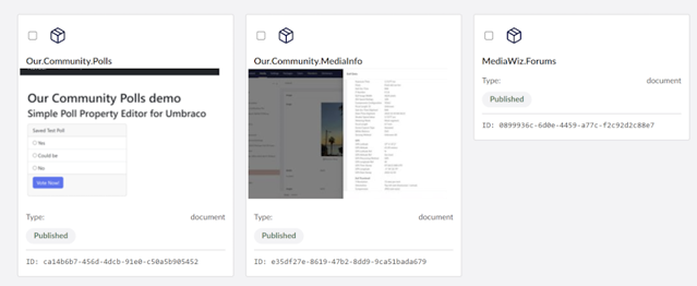
What We're Building
Our custom collection view will feature:
📦 Card-based grid layout - Responsive, modern design
🖼️ Image thumbnails - Fetched from Media Picker properties
✅ Selection support - Checkboxes for bulk operations
🎨 Status indicators - Color-coded publication states
📅 Metadata display - Show publish dates, culture, etc.
🔒 Authenticated API calls - Proper bearer token handling
Prerequisites
Before we start, you'll need:
Umbraco 17 (running on .NET 10)
Node.js and npm installed
Basic knowledge of TypeScript and Lit Element
An Umbraco extension project set up with Vite
Step 1: Setting Up the Component Structure
First, let's create our Lit Element component. Create a new file package-card-view.element.ts:
import { LitElement, html, css, customElement, state } from '@umbraco-cms/backoffice/external/lit';
import { UmbElementMixin } from '@umbraco-cms/backoffice/element-api';
import type { UmbDocumentCollectionItemModel } from '@umbraco-cms/backoffice/document';
import { UMB_COLLECTION_CONTEXT } from '@umbraco-cms/backoffice/collection';
import type { UmbSelectionManager } from '@umbraco-cms/backoffice/utils';
import { UMB_AUTH_CONTEXT } from '@umbraco-cms/backoffice/auth';

@customElement('mediawiz-package-card-view')
export class MediaWizPackageCardViewElement extends UmbElementMixin(LitElement) {
  @state()
  private _items: Array<UmbDocumentCollectionItemModel> = [];

  @state()
  private _selection: Array<string> = [];

  @state()
  private _imageCache: Map<string, string | null> = new Map();

  private _selectionManager?: UmbSelectionManager;
  private _authToken?: string;
Key points:
We extend
UmbElementMixin(LitElement)for Umbraco integration@state()decorators make properties reactiveWe'll cache images in a Map to avoid redundant API calls
Step 2: Consuming Contexts
Umbraco's new extension system uses a context pattern. We need two contexts:
constructor() {
  super();

  // Get authentication token for API calls
  this.consumeContext(UMB_AUTH_CONTEXT, async (authContext) => {
    if (!authContext) return;
    const config = authContext.getOpenApiConfiguration();
    this._authToken = await config?.token?.() ?? undefined;
  });

  // Get collection data and selection manager
  this.consumeContext(UMB_COLLECTION_CONTEXT, (context) => {
    if (!context) return;

    this._selectionManager = (context as any).selection as UmbSelectionManager;

    this.observe(
      context.items,
      (items) => {
        this._items = items as Array<UmbDocumentCollectionItemModel>;
        this._fetchImagesForItems();
      },
      'observeItems'
    );

    if (this._selectionManager) {
      this.observe(
        this._selectionManager.selection,
        (selection) => {
          this._selection = selection.filter((s): s is string => s !== null);
        },
        'observeSelection'
      );
    }
  });
}
Important discovery: The auth token is not a string—it's an async function! Call await config?.token?.() to get the actual bearer token.
Step 3: The Image Fetching Challenge
Here's where things get interesting. Collection items are lightweight—they don't include property values. To get images, we need to:
Fetch the full document data
Extract the
pkgImageproperty (a Media Picker)Get the media key from the Media Picker data
Fetch the media item to get the actual URL
Fetching Document Data
private async _fetchImagesForItems() {
  if (!this._authToken) {
    setTimeout(() => this._fetchImagesForItems(), 100);
    return;
  }

  for (const item of this._items) {
    if (this._imageCache.has(item.unique)) {
      continue; // Skip if cached
    }

    try {
      const response = await fetch(`/umbraco/management/api/v1/document/${item.unique}`, {
        headers: {
          'Authorization': `Bearer ${this._authToken}`,
        },
      });

      if (!response.ok) {
        this._imageCache.set(item.unique, null);
        continue;
      }

      const documentData = await response.json();
      const values = documentData.values; // Properties are at document level!
Gotcha #1: In Umbraco 17, document properties live at documentData.values, not documentData.variants[0].values. This took some debugging to figure out!
Extracting the Media Key
The Media Picker property returns an array of objects with media keys:
private _extractMediaKey(pkgImage: any): string | null {
  // Media Picker returns an array of objects with mediaKey
  if (Array.isArray(pkgImage) && pkgImage.length > 0) {
    return pkgImage[0].mediaKey || null;
  }

  // Handle legacy string formats
  if (typeof pkgImage === 'string' && pkgImage.trim().startsWith('{')) {
    try {
      const imageData = JSON.parse(pkgImage);
      return imageData.mediaKey || imageData.src || null;
    } catch {
      return null;
    }
  }

  return null;
}
Example Media Picker value:
[{
  mediaKey: "6f4898e7-11c4-4238-ade6-db9ae49171b3",
  key: "74938b22-0b34-4c94-9873-5fbc628d4411",
  mediaTypeAlias: "Image"
}]
Fetching Media URLs
Now we can fetch the actual media item:
private async _getMediaUrl(mediaKey: string): Promise<string | null> {
  try {
    const response = await fetch(`/umbraco/management/api/v1/media/${mediaKey}`, {
      headers: {
        'Authorization': `Bearer ${this._authToken}`,
      },
    });

    if (!response.ok) return null;

    const mediaData = await response.json();
    let url = null;

    // Check values array for umbracoFile property
    if (mediaData.values && Array.isArray(mediaData.values)) {
      const umbracoFileValue = mediaData.values.find((v: any) => v.alias === 'umbracoFile');
      if (umbracoFileValue) {
        if (typeof umbracoFileValue.value === 'string') {
          url = umbracoFileValue.value;
        } else if (umbracoFileValue.value?.src) {
          url = umbracoFileValue.value.src;
        }
      }
    }

    if (url) {
      return `${url}?width=200&height=200`; // Add resize params
    }

    return null;
  } catch (error) {
    console.error('Error fetching media:', mediaKey, error);
    return null;
  }
}
Pro tip: The umbracoFile value structure is:
{
  src: "/media/nbja3wnn/poll.png",
  crops: [],
  focalPoint: null
}
Step 4: Rendering the Cards
Now for the fun part—rendering our beautiful cards:
render() {
  if (!this._items || this._items.length === 0) {
    return html`
      <div class="empty-state">
        <p>No documents found</p>
      </div>
    `;
  }

  return html`
    <div class="card-grid">
      ${this._items.map((item) => {
        const variant = item.variants?.[0];
        const name = variant?.name || 'Untitled';
        const state = variant?.state;
        const editUrl = `/section/content/workspace/document/edit/${item.unique}`;
        const imageUrl = this._getImageUrl(item);
        const updateDate = (variant as any)?.updateDate
          ? new Date((variant as any).updateDate).toLocaleDateString(undefined, {
              year: 'numeric',
              month: 'short',
              day: 'numeric'
            })
          : null;

        return html`
          <a href=${editUrl} class="card-link">
            <div class="card">
              <div class="card-header">
                <input
                  type="checkbox"
                  class="card-checkbox"
                  .checked=${this._selection.includes(item.unique)}
                  @click=${(e: Event) => e.stopPropagation()}
                  @change=${(e: Event) => this._handleSelect(item, e)}
                />
                <div class="card-icon">
                  <uui-icon name="icon-box"></uui-icon>
                </div>
              </div>

              <div class="card-content">
                <h3 class="card-title">${name}</h3>
                ${imageUrl ? html`
                  <div class="card-image">
                    <img src=${imageUrl} alt=${name} />
                  </div>
                ` : ''}

                ${state ? html`
                  <div class="card-status">
                    <uui-tag
                      size="s"
                      color="${state === 'Published' ? 'positive' : 'default'}"
                      look="secondary">
                      ${state}
                    </uui-tag>
                  </div>
                ` : ''}
              </div>

              <div class="card-footer">
                ${updateDate ? html`
                  <small class="card-date">Updated: ${updateDate}</small>
                ` : html`
                  <small class="card-date">No date</small>
                `}
              </div>
            </div>
          </a>
        `;
      })}
    </div>
  `;
}
Navigation gotcha: Wrap the entire card in an <a> tag rather than using JavaScript click handlers. This provides proper browser navigation behavior (right-click to open in new tab, etc.).
Step 5: Styling with Umbraco Design Tokens
Use Umbraco's CSS custom properties for consistent theming:
static styles = css`
  :host {
    display: block;
    padding: var(--uui-size-space-4);
  }

  .card-grid {
    display: grid;
    grid-template-columns: repeat(auto-fill, minmax(280px, 1fr));
    gap: var(--uui-size-space-5);
  }

  .card {
    background: var(--uui-color-surface);
    border: 1px solid var(--uui-color-border);
    border-radius: var(--uui-border-radius);
    padding: var(--uui-size-space-4);
    cursor: pointer;
    transition: all 0.2s ease;
  }

  .card:hover {
    border-color: var(--uui-color-border-emphasis);
    box-shadow: var(--uui-shadow-depth-2);
    transform: translateY(-2px);
  }

  .card-image {
    width: 100%;
    height: 200px;
    overflow: hidden;
    border-radius: var(--uui-border-radius);
  }

  .card-image img {
    width: 100%;
    height: 100%;
    object-fit: cover;
    transition: transform 0.3s ease;
  }

  .card:hover .card-image img {
    transform: scale(1.05);
  }
`;
Step 6: Registering the Collection View
Create a manifest.ts file:
import type { ManifestCollectionView } from '@umbraco-cms/backoffice/extension-registry';

const collectionViews: Array<ManifestCollectionView> = [
  {
    type: 'collectionView',
    alias: 'MediaWiz.CollectionView.Package.Card',
    name: 'Package Card View',
    js: () => import('./package-card-view.element.js'),
    weight: 200,
    meta: {
      label: 'Card View',
      icon: 'icon-grid',
      pathName: 'card',
    },
    conditions: [
      {
        alias: 'Umb.Condition.CollectionAlias',
        match: 'Umb.Collection.Document',
      },
      {
        alias: 'Umb.Condition.SectionAlias',
        match: 'Umb.Section.Content',
      },
    ],
  },
];

export const manifests = collectionViews;
Important settings:
weight: 200- Makes this view appear prominently in the view selectorpathName: 'card'- The URL segment when this view is activeTwo conditions ensure it only appears in the Content section for document collections
Step 7: Building and Testing
Add to your bundle.manifests.ts:
import { manifests as collectionViews } from './collection-views/manifest.ts';

export const manifests = [
  ...collectionViews,
  // ... other manifests
];
Build the extension:
npm run build
Or watch for changes during development:
npm run watch
Common Issues and Solutions
Issue 1: Collection View Doesn't Appear
Solution: Check that:
The manifest has proper conditions (CollectionAlias and SectionAlias)
The weight is high enough (200+)
The pathName is unique and lowercase
Issue 2: Images Don't Load
Solution:
Verify the auth token is being retrieved
Check that property values are at
documentData.valuesnotvariant.valuesEnsure the Media Picker property alias matches (
pkgImagein our case)
Issue 3: 401 Unauthorized Errors
Solution:
Remember to call the token function:
await config?.token?.()Include the Authorization header in all Management API calls
Wait for the token to be available before fetching
Issue 4: Cards Don't Navigate
Solution:
Use proper anchor (
<a>) elements instead of div with click handlersUse the correct Umbraco routing:
/section/content/workspace/document/edit/{id}
Performance Considerations
Our implementation includes several performance optimizations:
Image Caching - Once fetched, images are cached in a Map
Lazy Loading - Images are only fetched when items are displayed
Skip Cached Items - We check the cache before making API calls
Query Parameters - Resize images on the server (
?width=200&height=200)
Production Checklist
Before deploying:
✅ Remove debug
console.logstatements✅ Build with production settings (
npm run build)✅ Test with different document types
✅ Verify images load correctly
✅ Test selection and bulk operations
✅ Check responsive behavior on different screen sizes
✅ Ensure the
wwwroot/App_Plugins/folder is included in deployment
Extending the Component
Want to take it further? Consider adding:
Search filtering - Filter cards by name or properties
Sorting options - Sort by name, date, or status
Infinite scroll - Load more items as you scroll
Drag & drop - Reorder documents by dragging cards
Quick actions - Publish/unpublish buttons on cards
Custom properties - Display any document property you need
Multiple image support - Show image galleries or carousels
Conclusion
Building custom collection views in Umbraco 17 is powerful once you understand the extension system. The combination of Lit Element, TypeScript, and Umbraco's Management API gives you complete control over how content is displayed.
The key takeaways:
Context is king - Use
consumeContextto access Umbraco's data and servicesAuth matters - Always include bearer tokens for Management API calls
Data structure - Document properties live at different levels than you might expect
Web Components - Lit Element provides a modern, reactive framework
Design tokens - Use Umbraco's CSS variables for consistent theming
I hope this guide helps you build amazing custom views for your Umbraco projects.
Happy coding!
Handy Resources
This collection view was built as part of my MediaWiz17 extension for Umbraco, using Claude Sonnet 4.5 in VS
Questions or suggestions? Feel free to reach out!
Latest Spells from the Grimoire
This guide walks through building a real Tiptap extension for the Umbraco backoffice — a DateTime inserter that lets editors insert the current date, time, or both into a Rich Text Editor (RTE) field from a toolbar dropdown menu
building a custom collection view for Umbraco 17 that displays documents as beautiful cards with images, using the new extension system and Lit Element web components.
In this post, I'll show you how to build a flexible, on-the-fly watermarking system using SixLabors.ImageSharp.Web that doesn't require modifying your original images.
If you’ve just deployed an Umbraco site and it keeps bouncing you back to the installer, take a breath — you’re not alone. This is one of the most common “I’m losing my mind” moments in the Umbraco world, and the good news is: the root cause is almost always the same.
Building a Custom Polls Feature in Umbraco 17 Backoffice. A complete, modern walkthrough for extending the new backoffice